Architects pays a lot of attention to the fonts we use. Architects have proven to be especially picky in chosen typography. To put it together they are perfectionist. Even a tiny details irritates them too much. I mean if you are a fellow architect you know where I am coming from.......Right!
Mies van der Rohe once stated “God is in the details” and apparently we take it seriously 😃
- Graphic elements are constantly used in a extensive way to make a scheme of their works. Among them, what should be prioritized are the drawings, techniques, styles & patterns. But the most particular icon that helps them to determine a clear out look is the composition and the idea generally the FONT.
- Font types are designs assumed by a pattern. There are variations which can be highlighted as light, italic, bold also by the type of box high-uppercase and lower-lowercase.
- The correct choice of font can communicate to simple rhythm. It leads to a mental calmness through the glace within the presentation. There is no correct scheme in this technique however you can choose it accordingly to which soothes the eye.
Further being said here is a list of font you can use for free....
Font name Website/Download link
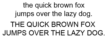
Arial https://goo.gl/BUEoaY
City Blueprint https://goo.gl/fAcyQ
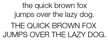
Helvetica neue https://goo.gl/XdY97M
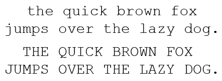
Courier new https://goo.gl/qW1szj
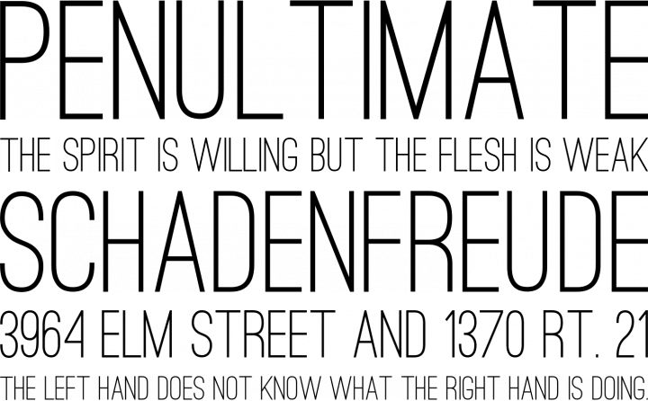
Ostrich Sans https://goo.gl/LTN8EF

Flux Architect https://goo.gl/KpBquD


Tk-Architect https://goo.gl/ytHnSN

Damned Architect https://goo.gl/wnFzhB

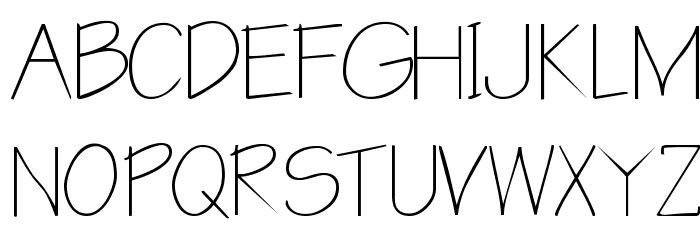
Architect's Daughter https://goo.gl/4G3Frr

Draftsman https://goo.gl/vqyj4j
These are the fonts you can use for free. If you have your own fonts you can share with me. Spray down your thoughts on the comments below.
All rights reserved.
Comments
Post a Comment